Color Terms
Of The Globe
Mapping and documenting the color terms of more than 300 languages around the world.
Overview
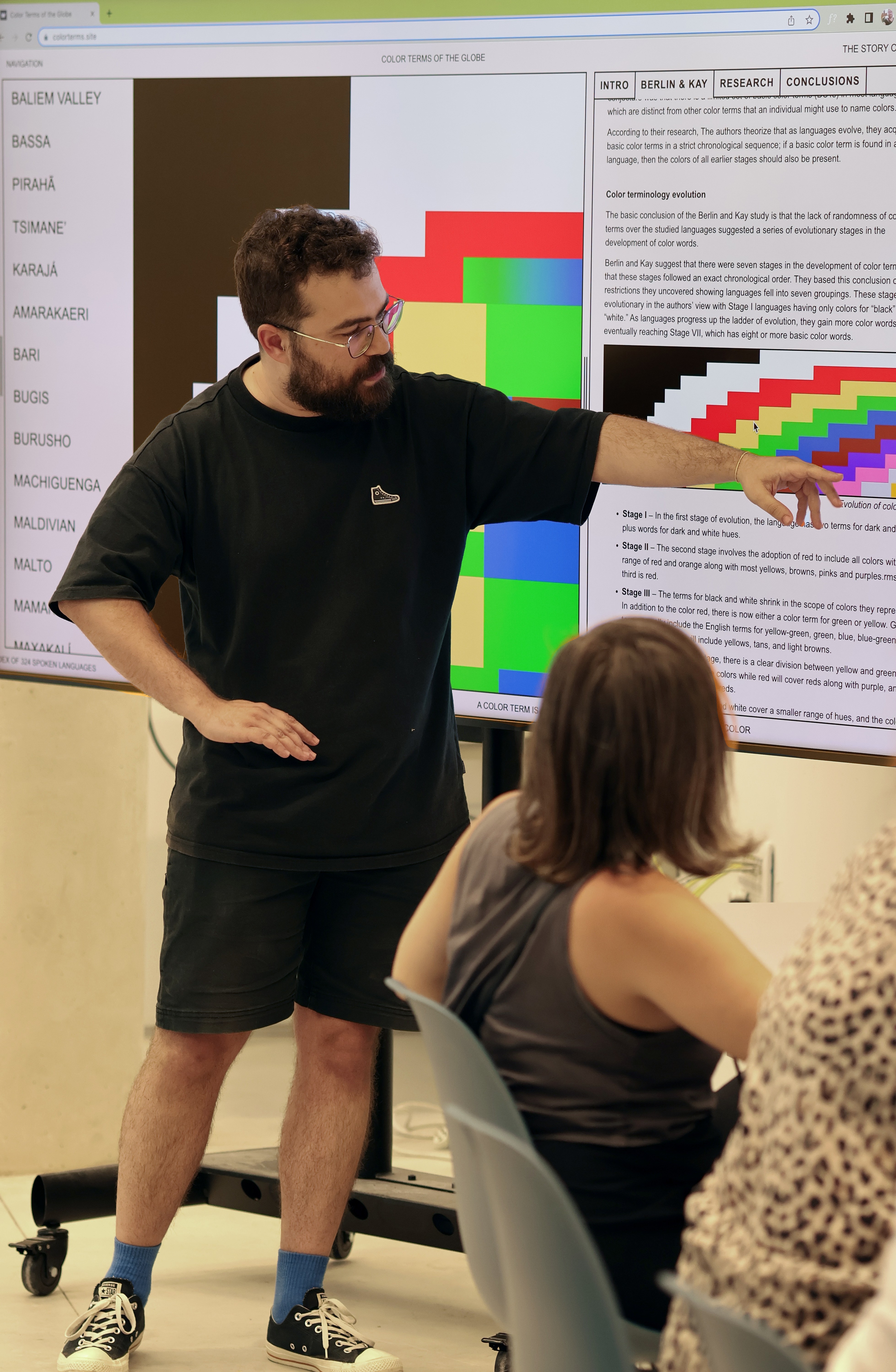
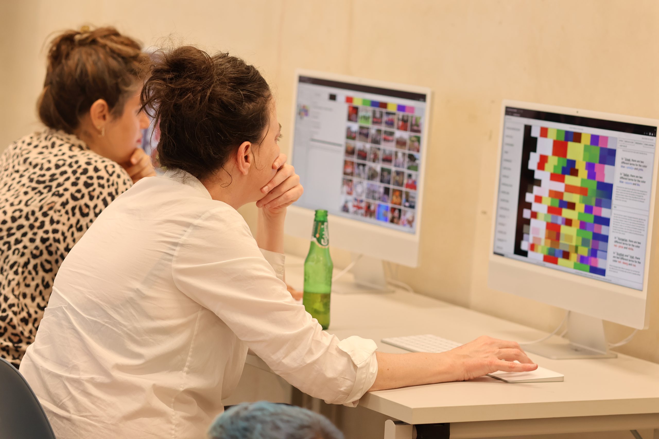
"The Color Terms of the Globe" project, my final endeavor at Bezalel Academy of Art and Design, maps color terms in 300+ languages worldwide. This interactive website offers insights into how diverse cultures perceive and use colors, allowing users to filter languages by country and speakers. Each language opens to reveal a short description and 36 curated images showcasing its unique color palette, providing a fascinating exploration of the intersection between language, culture, and color.
Brief
Create a comprehensive index of your choice, paired with a medium of your choosing. The objective is to allow users to efficiently filter and locate specific items within the index.
The research
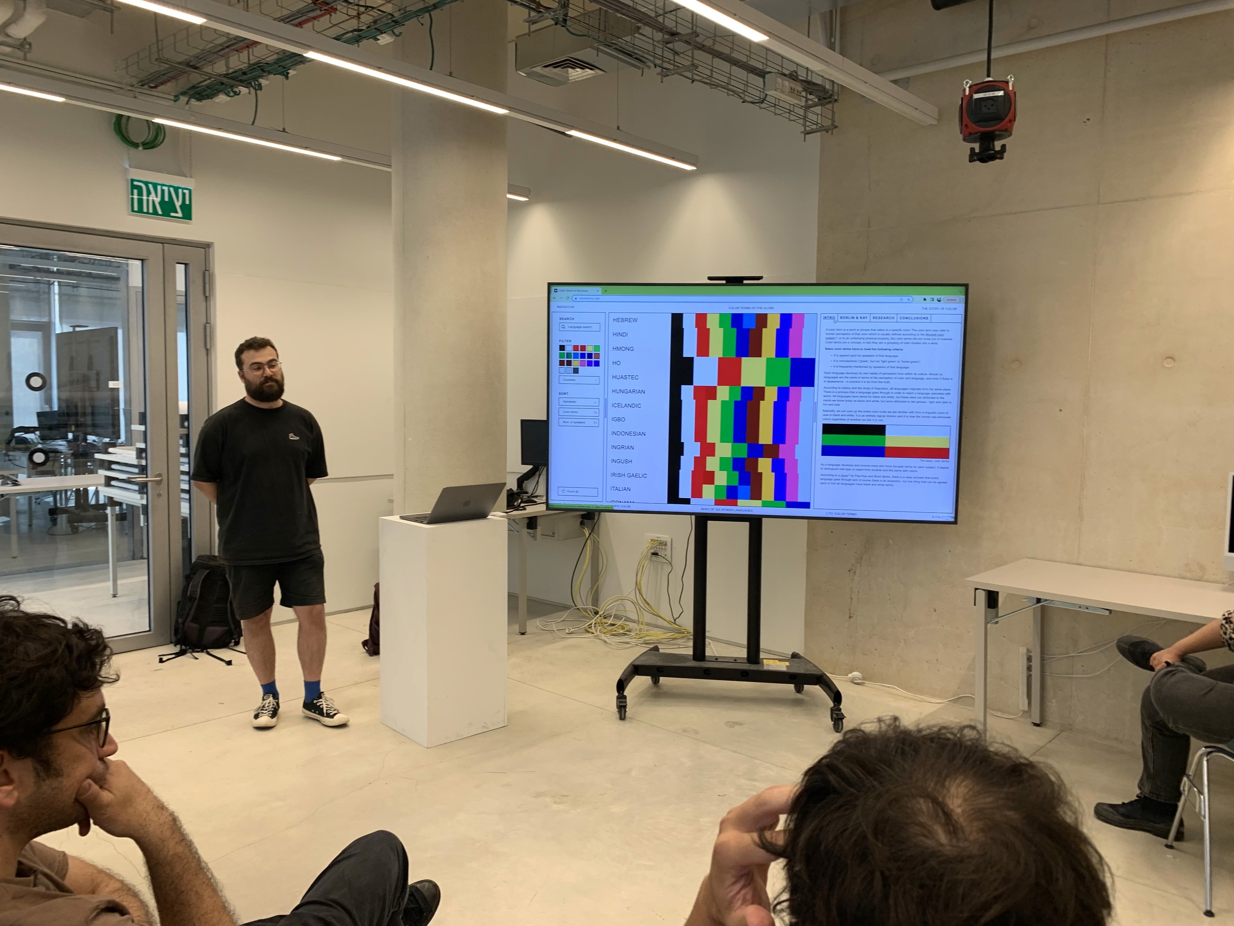
In the initial phase, I conducted an extensive study, scouring language-related websites and exploring the historical evolution of colors in human culture. My goal was to identify languages with available information on their lexicon and color term methods. This meticulous process led to the successful collection of data from 324 languages, including their color terms, relevant information, geographical location, and the number of speakers. To streamline the project, I organized this wealth of information into a structured table, laying the foundation for the comprehensive and interactive exploration featured in my final project.
First Medium - print
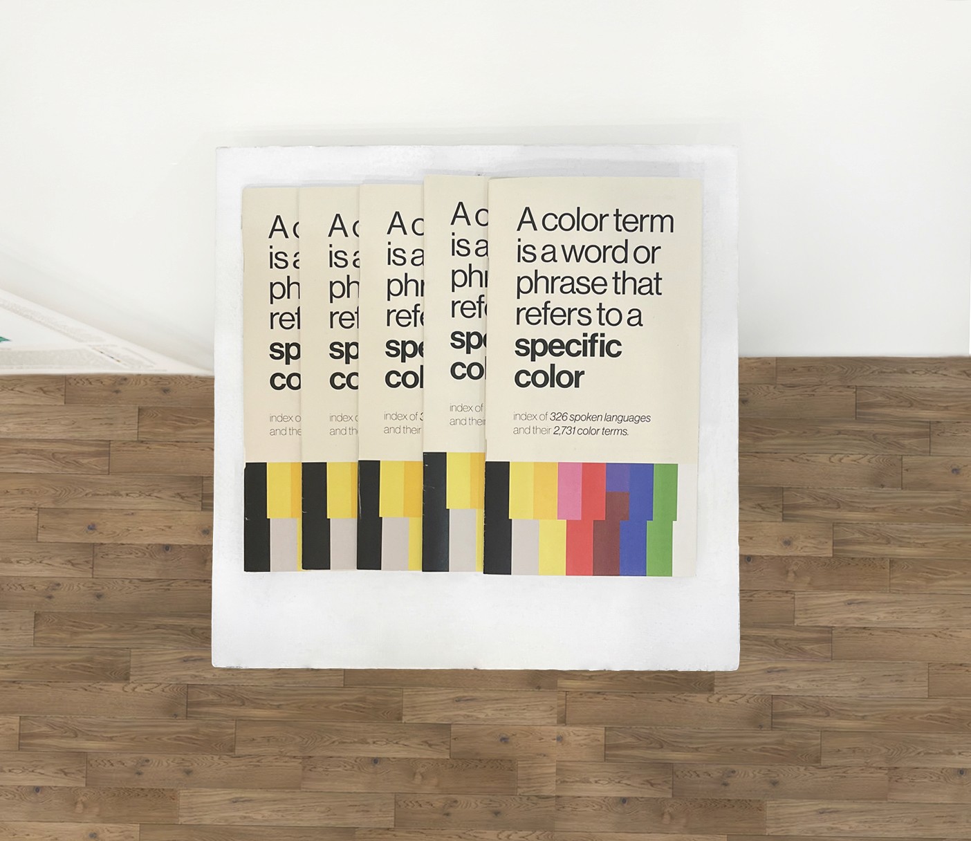
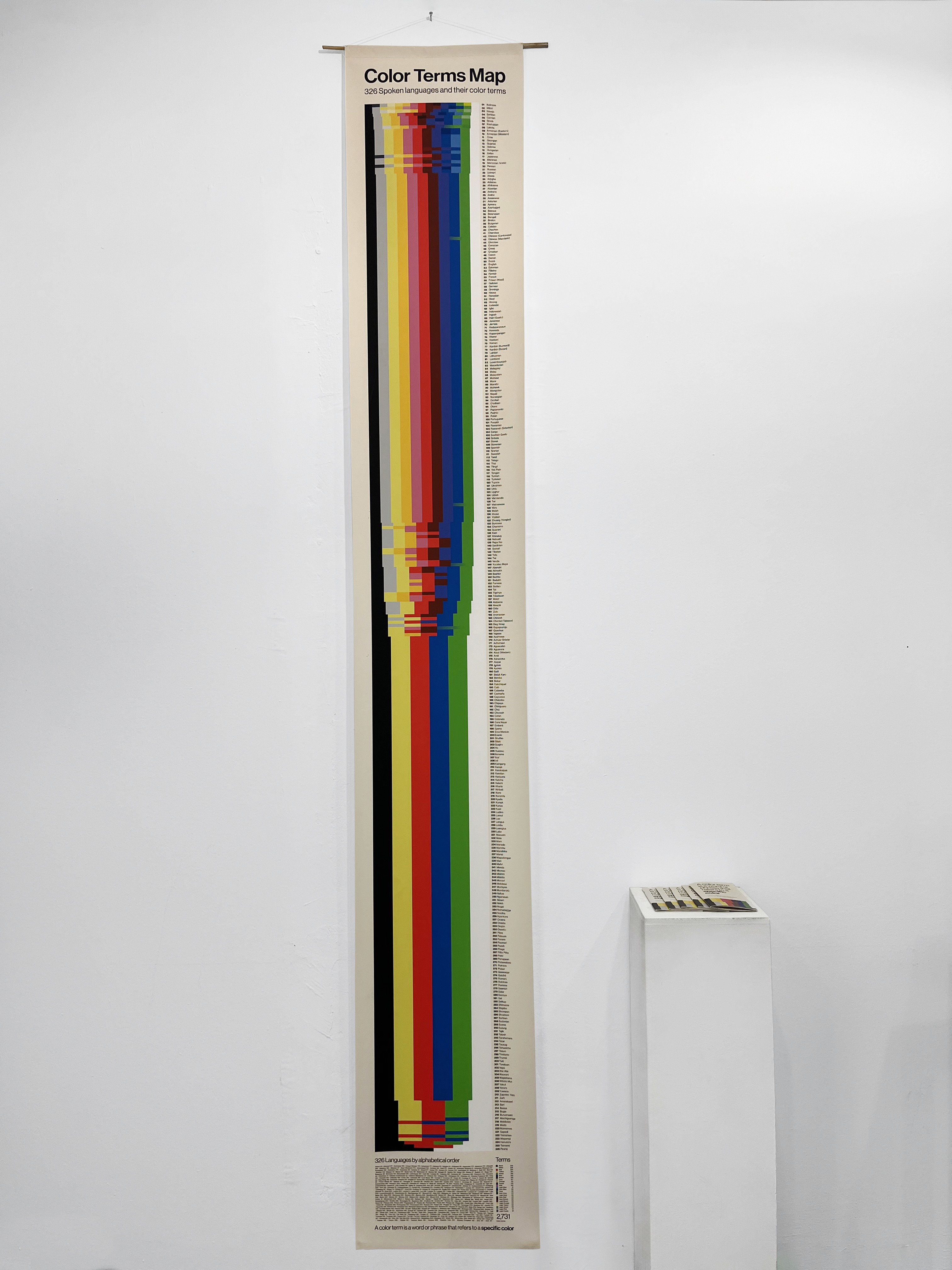
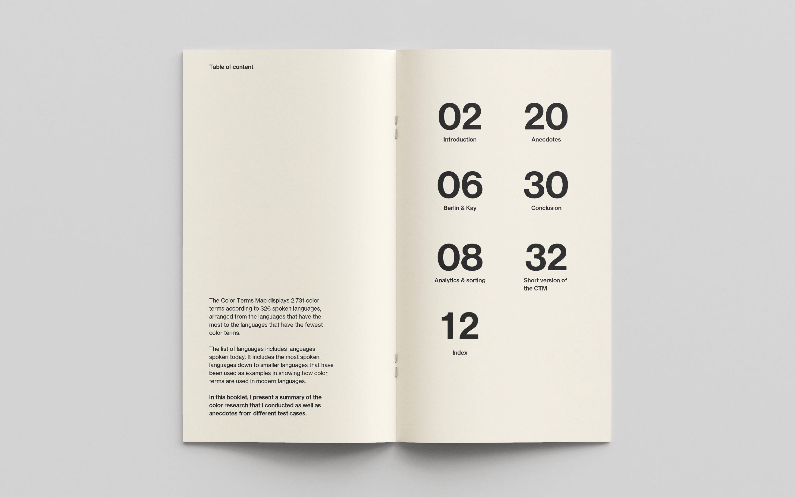
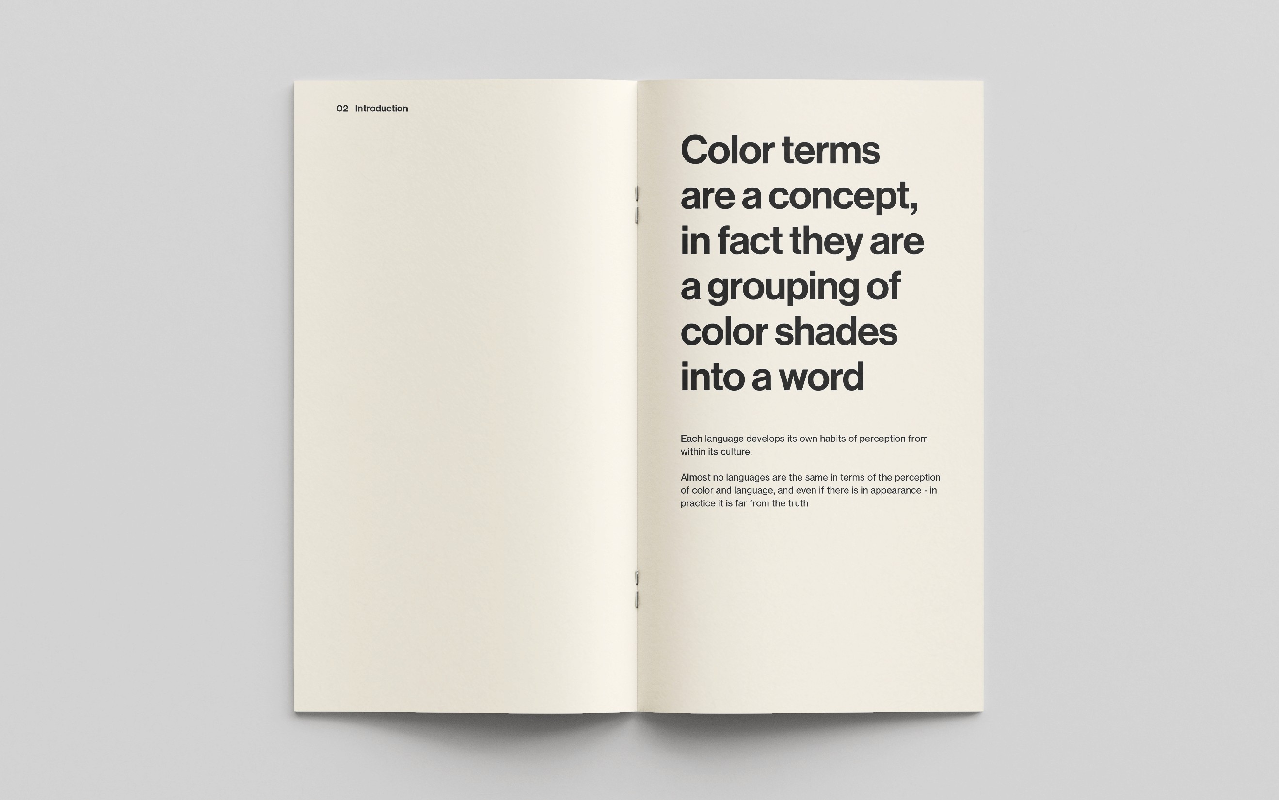
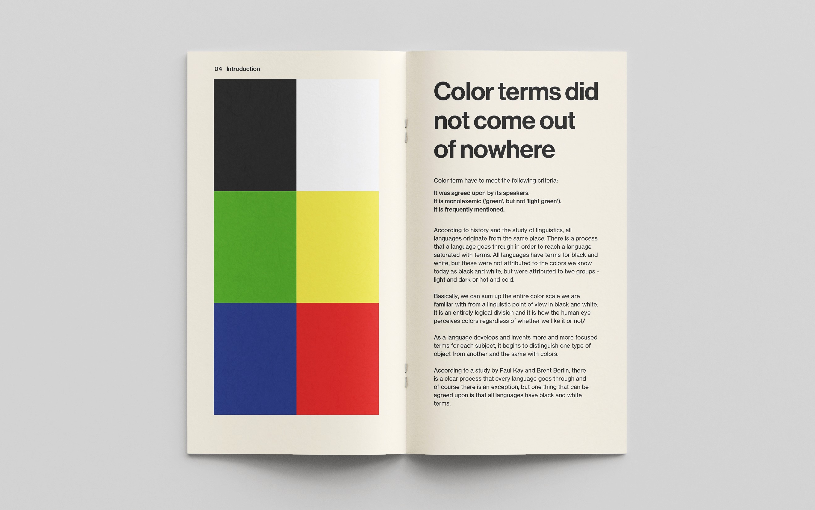
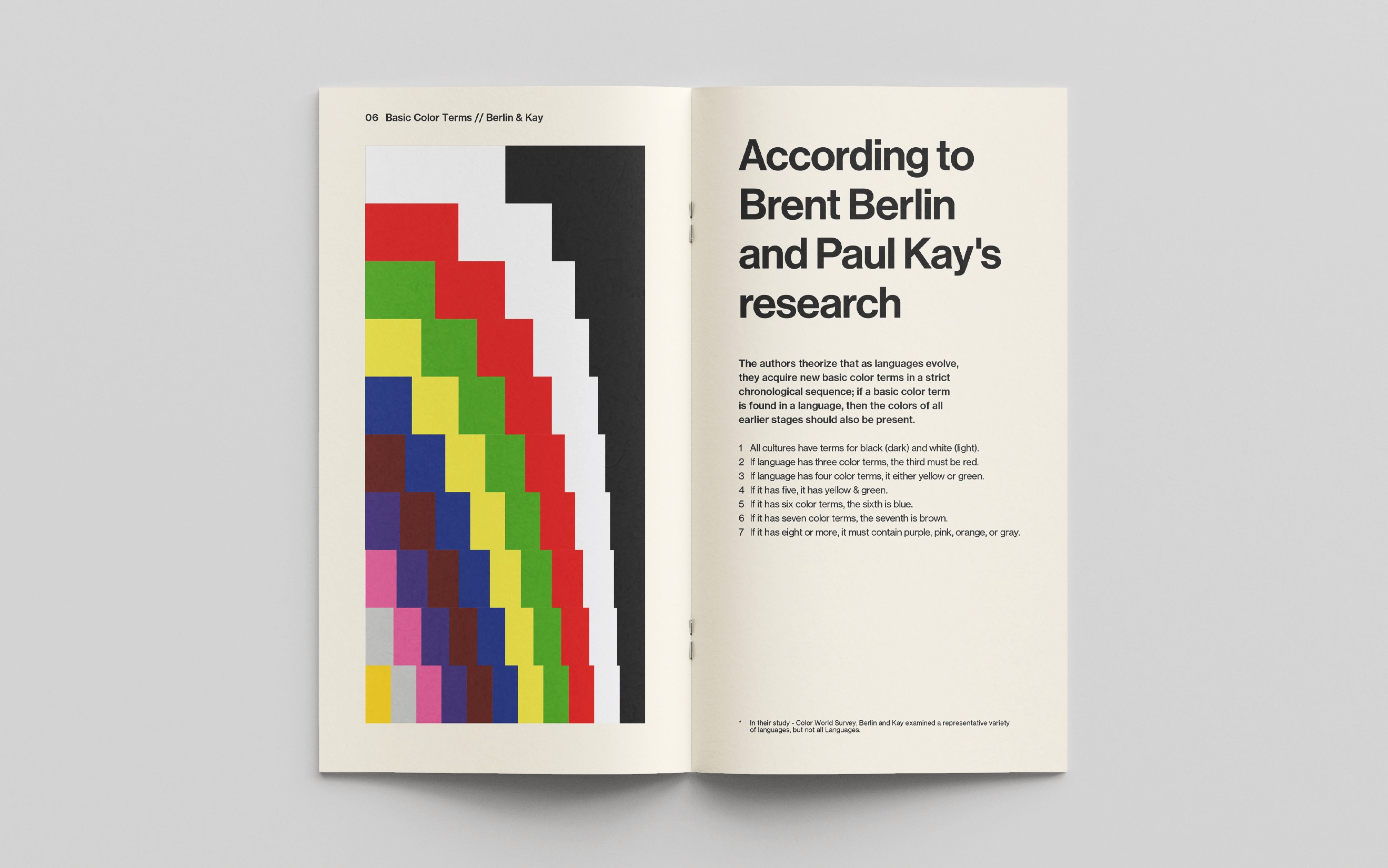
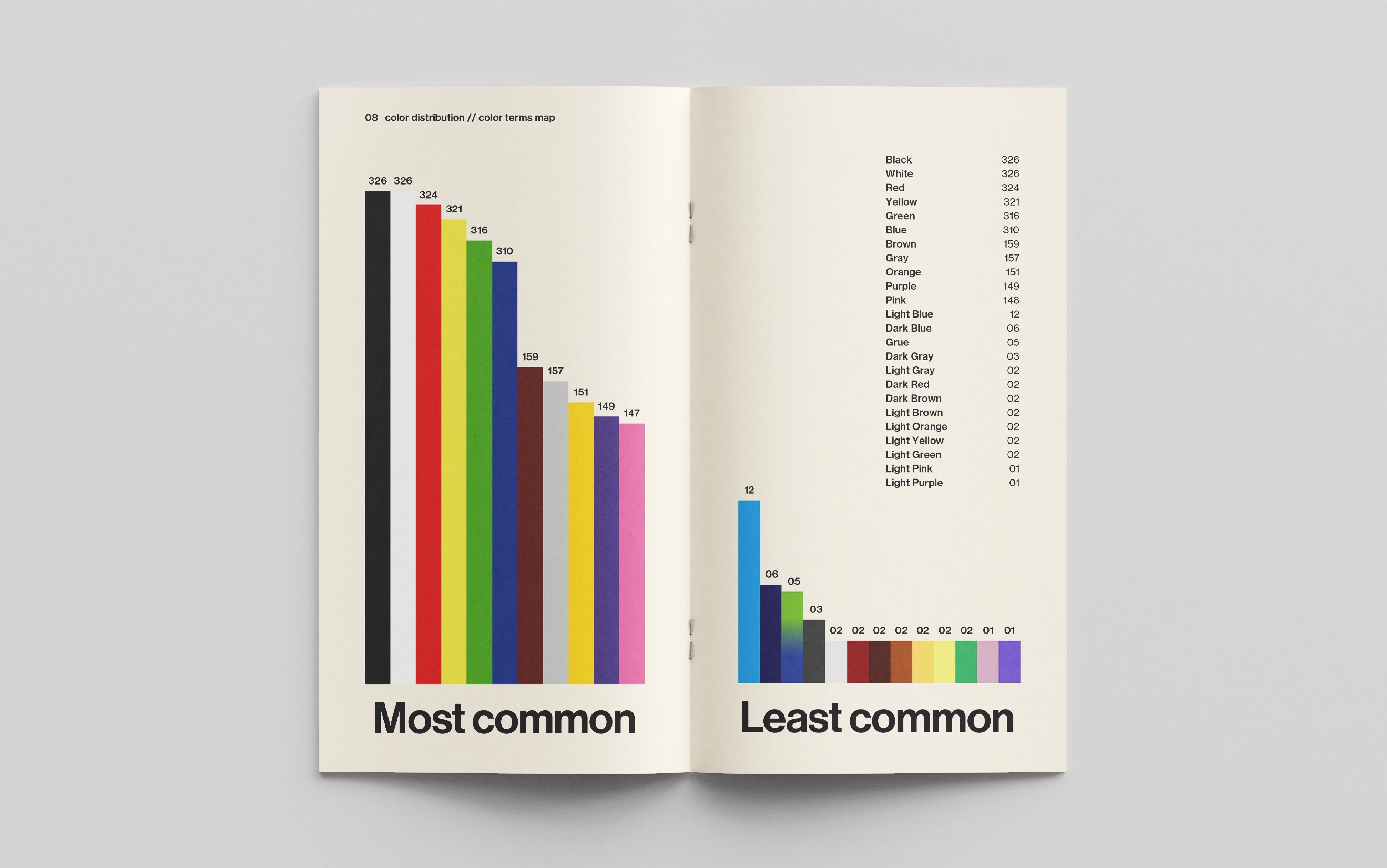
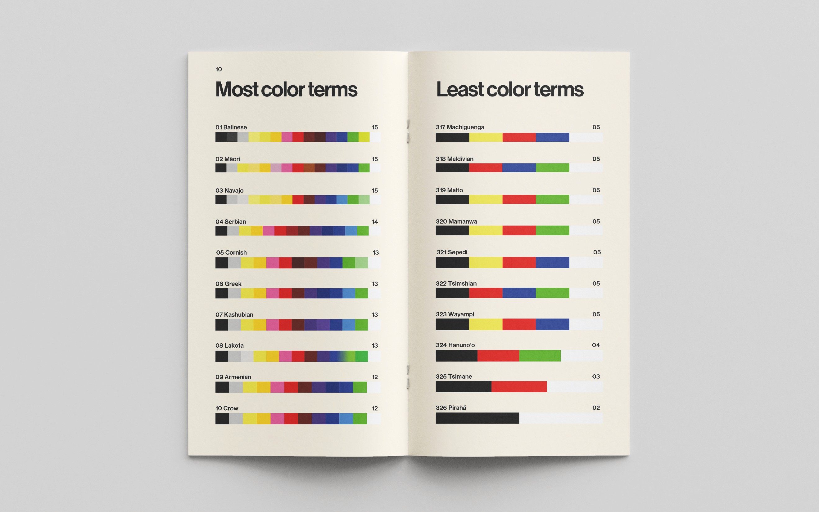
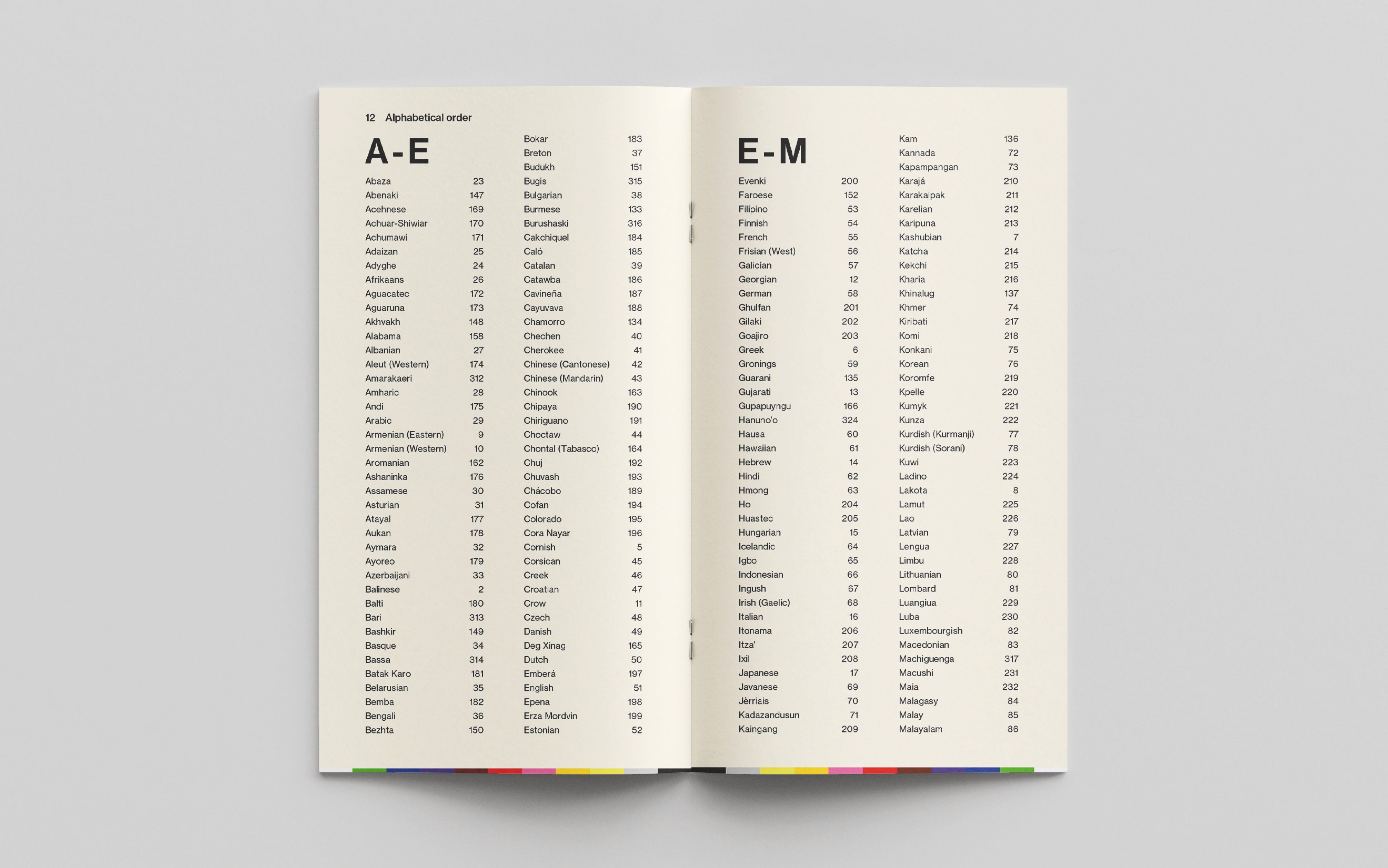
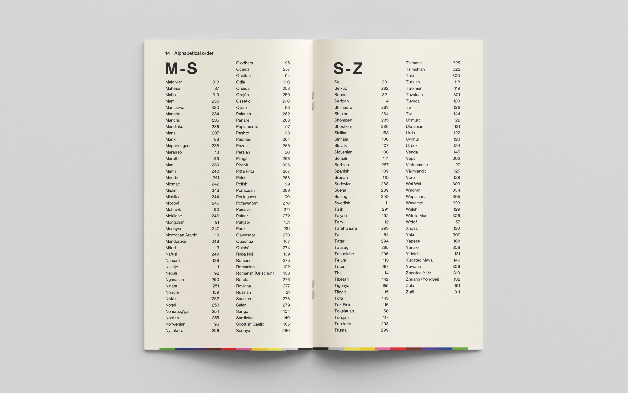
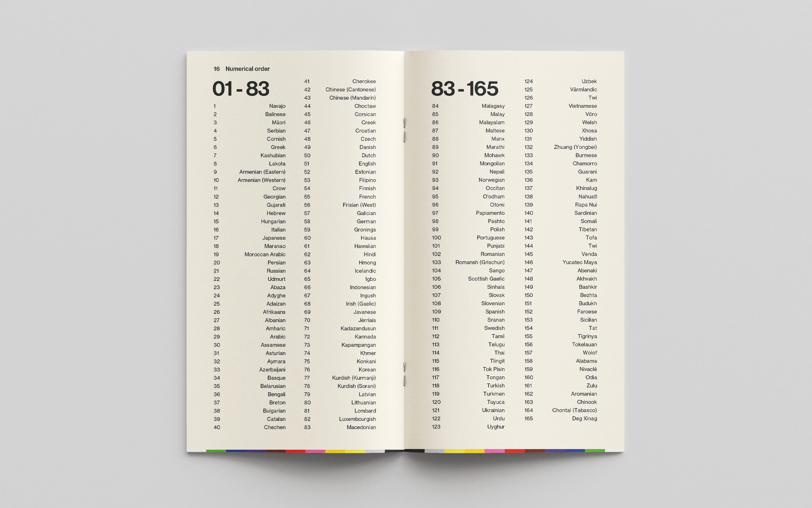
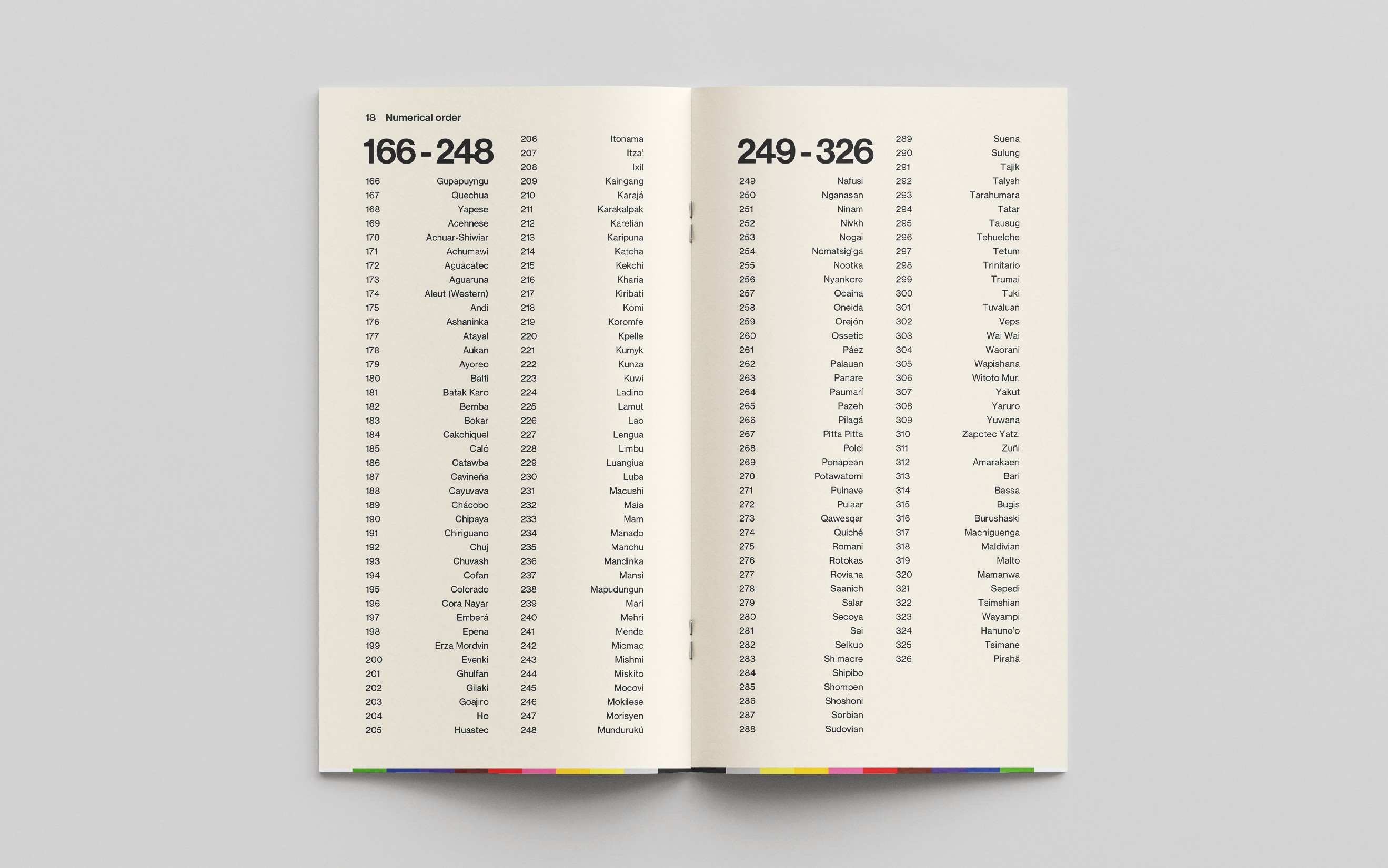
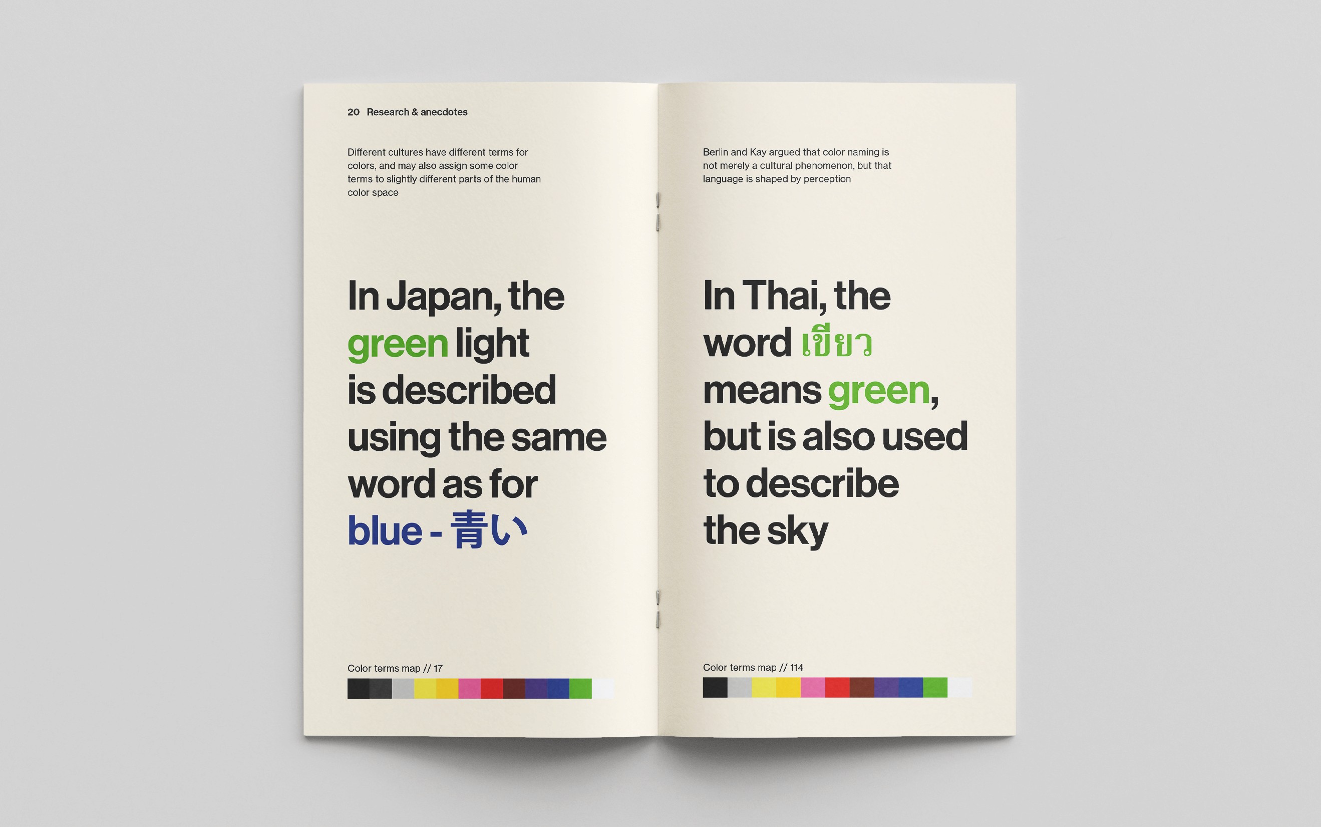
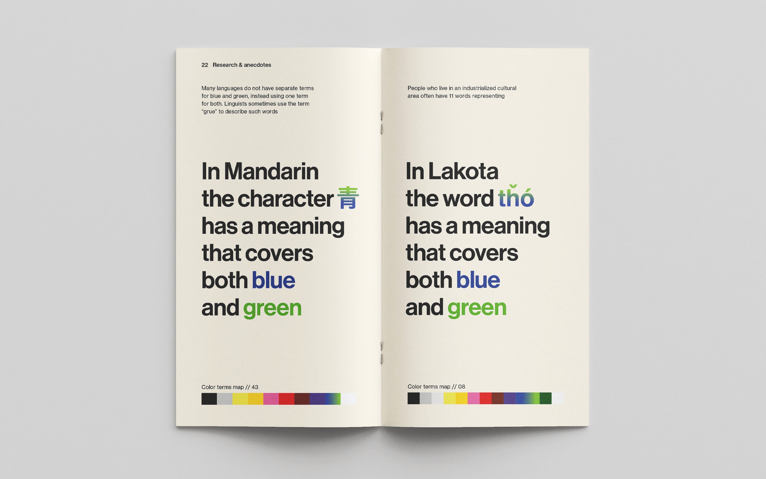
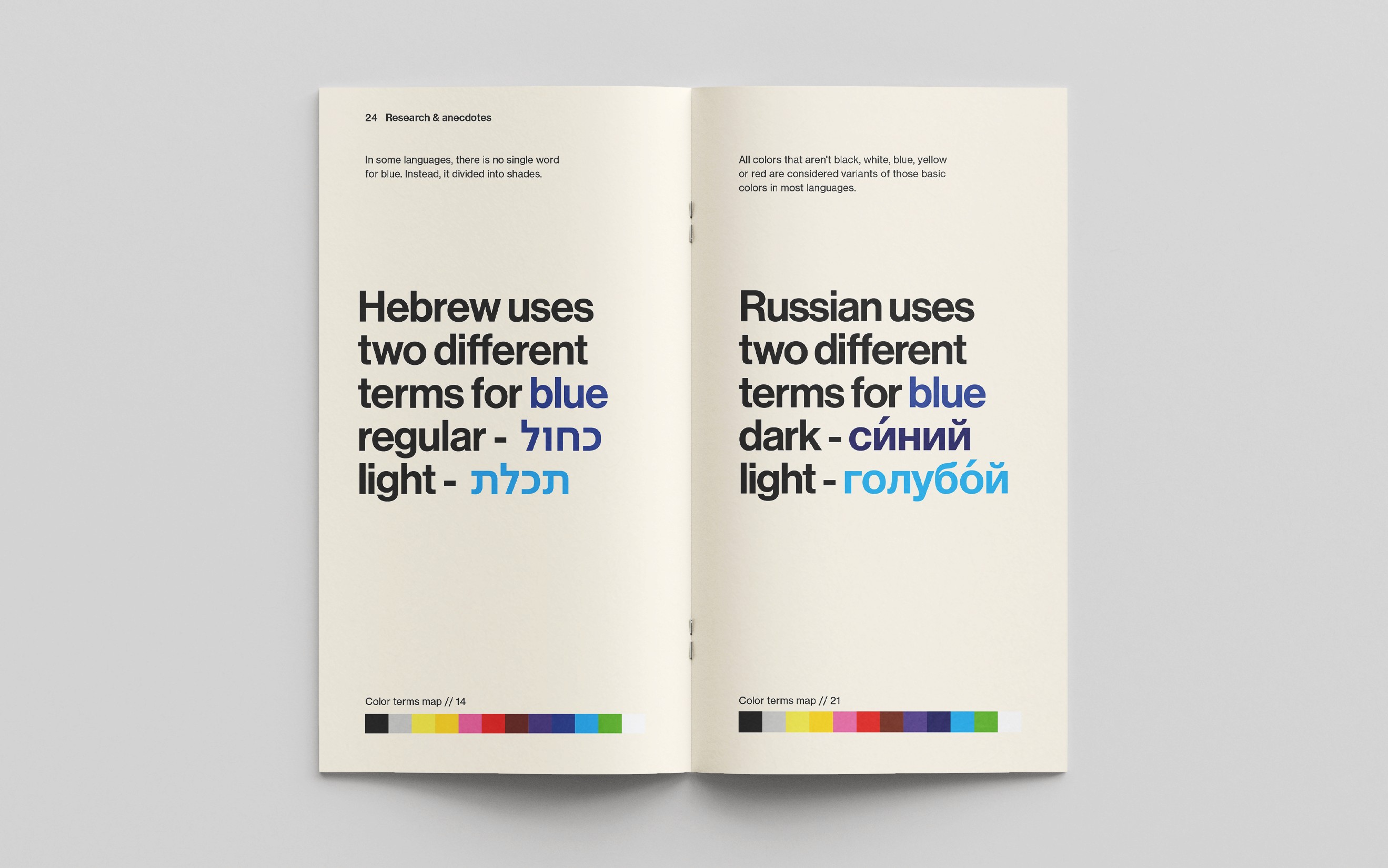
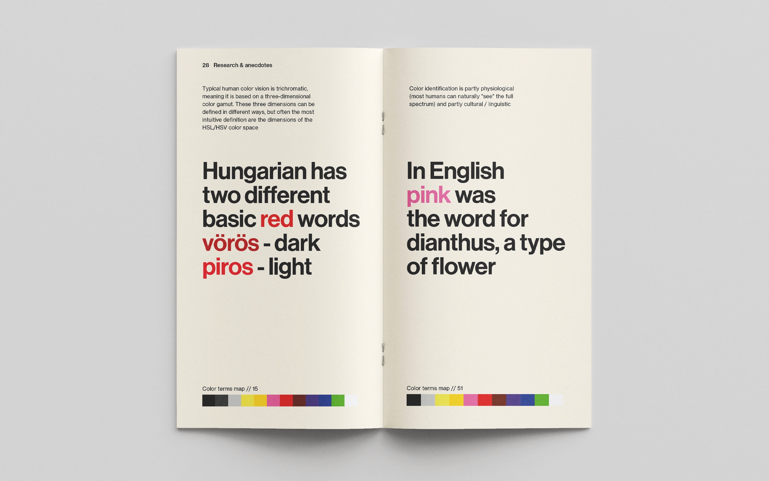
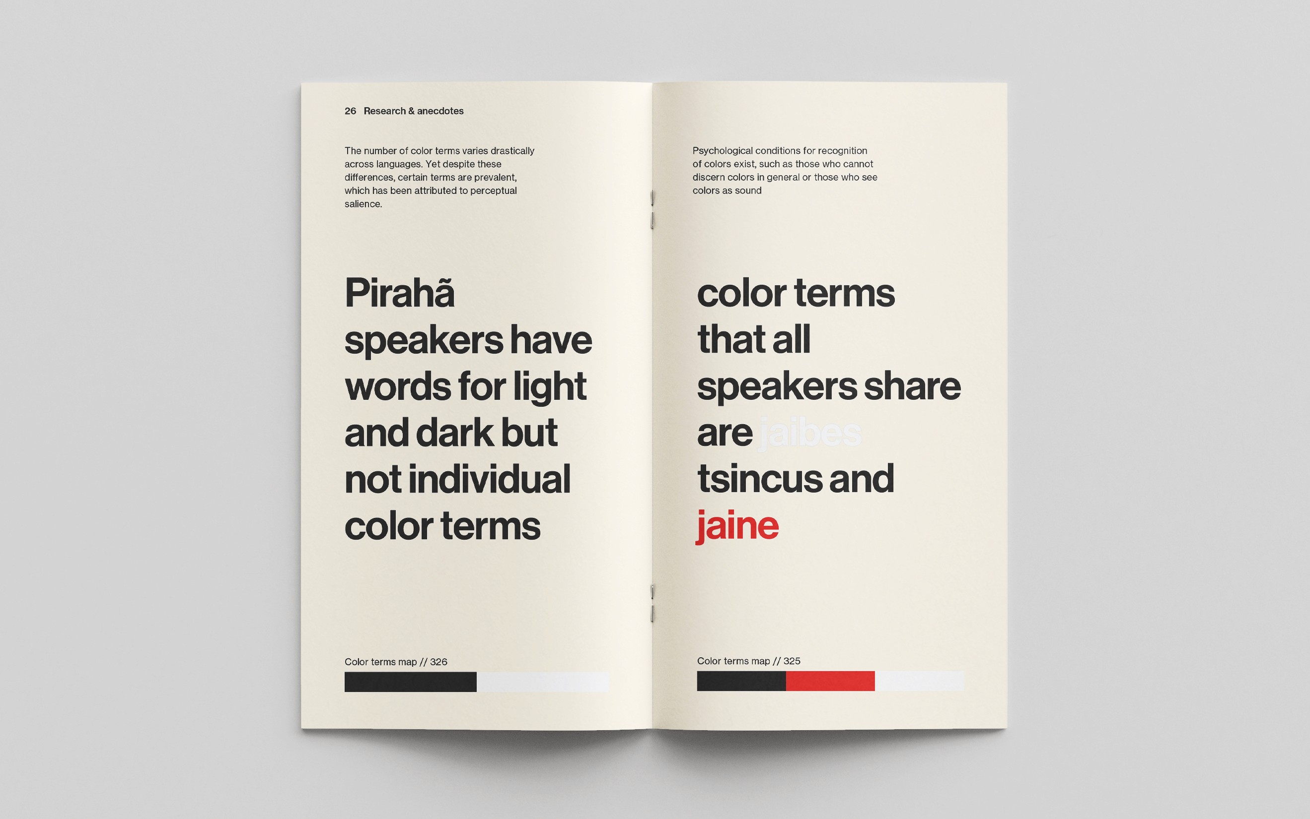
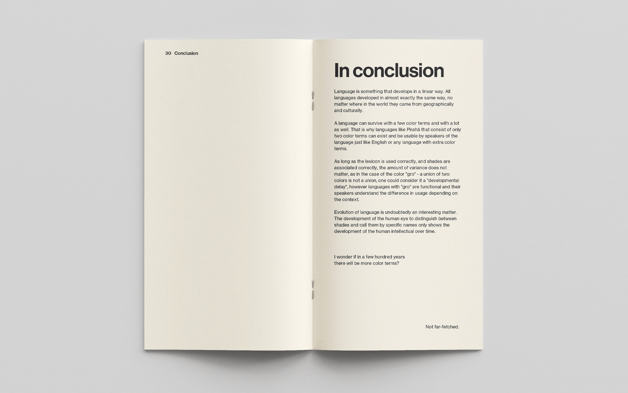
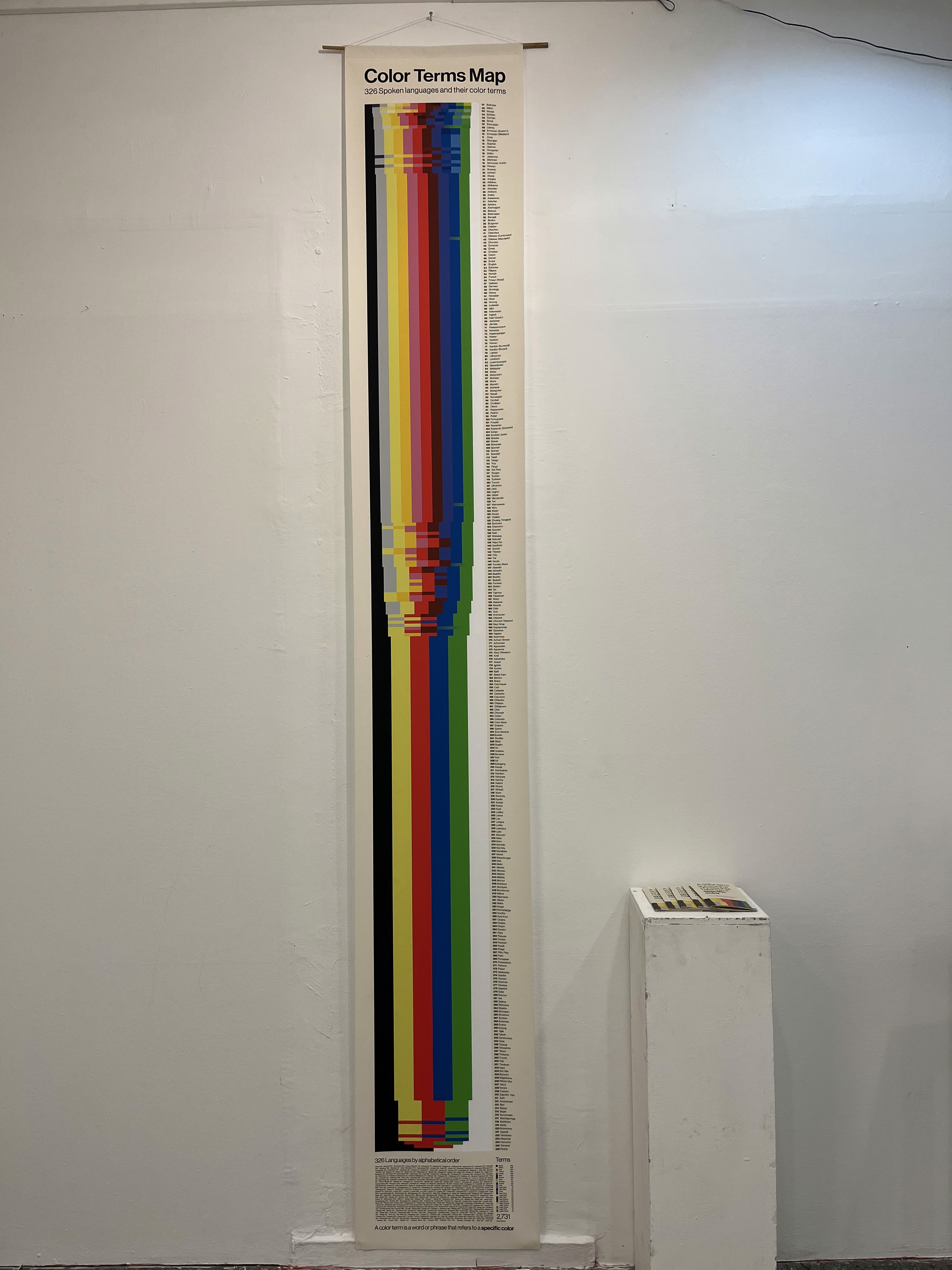
After completing the research and organizing the data into a comprehensive table, my focus shifted to determining the medium and graphic language for the project. Opting for a print approach, I conceptualized a 4-meter-long poster accompanied by a booklet containing detailed research and an index corresponding to the poster. The graphic language embraced the simplicity and clarity of 'Helvetica' to ensure a seamless presentation that directs attention to the content rather than the font itself. To enhance visibility, I chose cream-colored pages instead of white, allowing the 'white' color term to stand out. To facilitate reader comprehension, I represented color terms as blocks rather than words, ensuring a user-friendly experience.

Mid-Conclusions
Upon the completion and physical manifestation of the poster and booklet, it became apparent that while the project possessed aesthetic appeal and functionality, improvements were necessary to enhance navigability. Recognizing the need for a more user-friendly experience, I decided to expand the project's scope. Beyond color terms, I aimed to include additional information about the languages and anecdotes, enriching the overall narrative.
Transition to Website
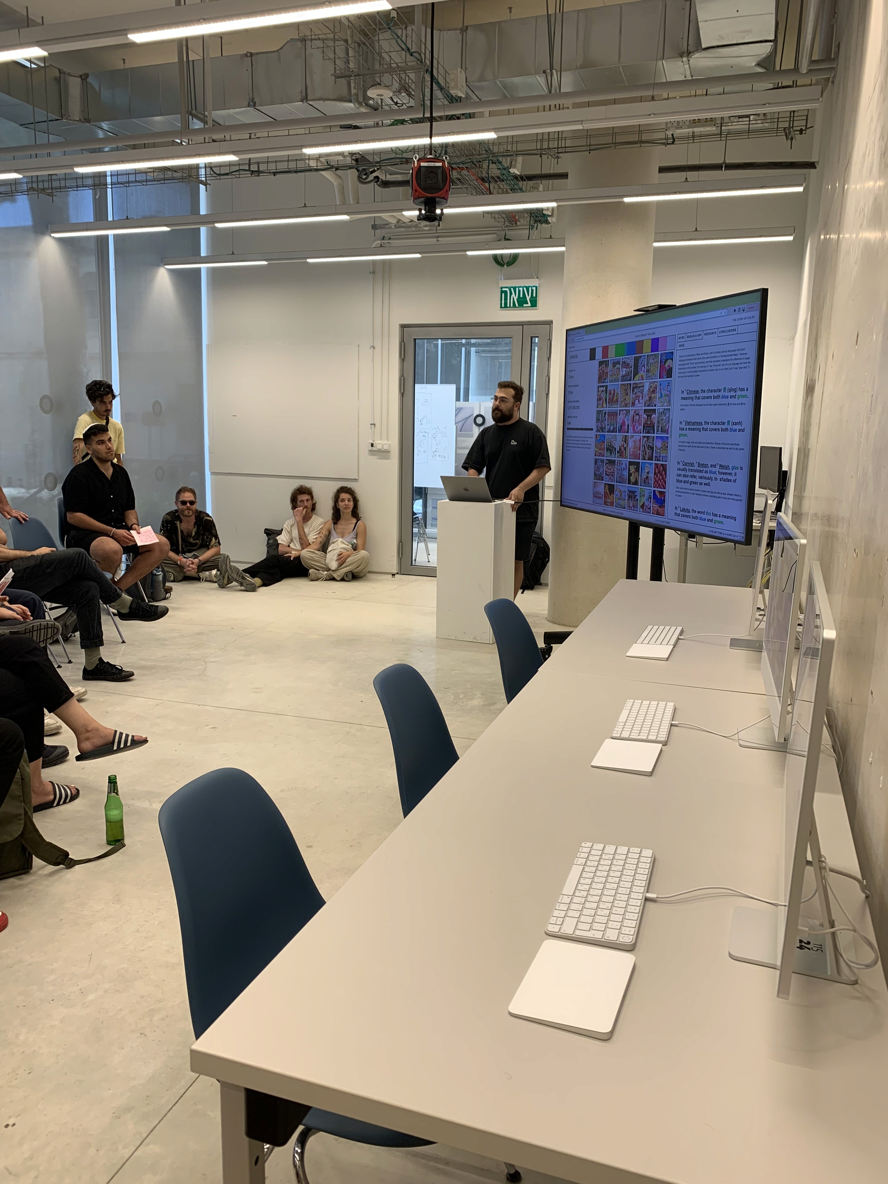
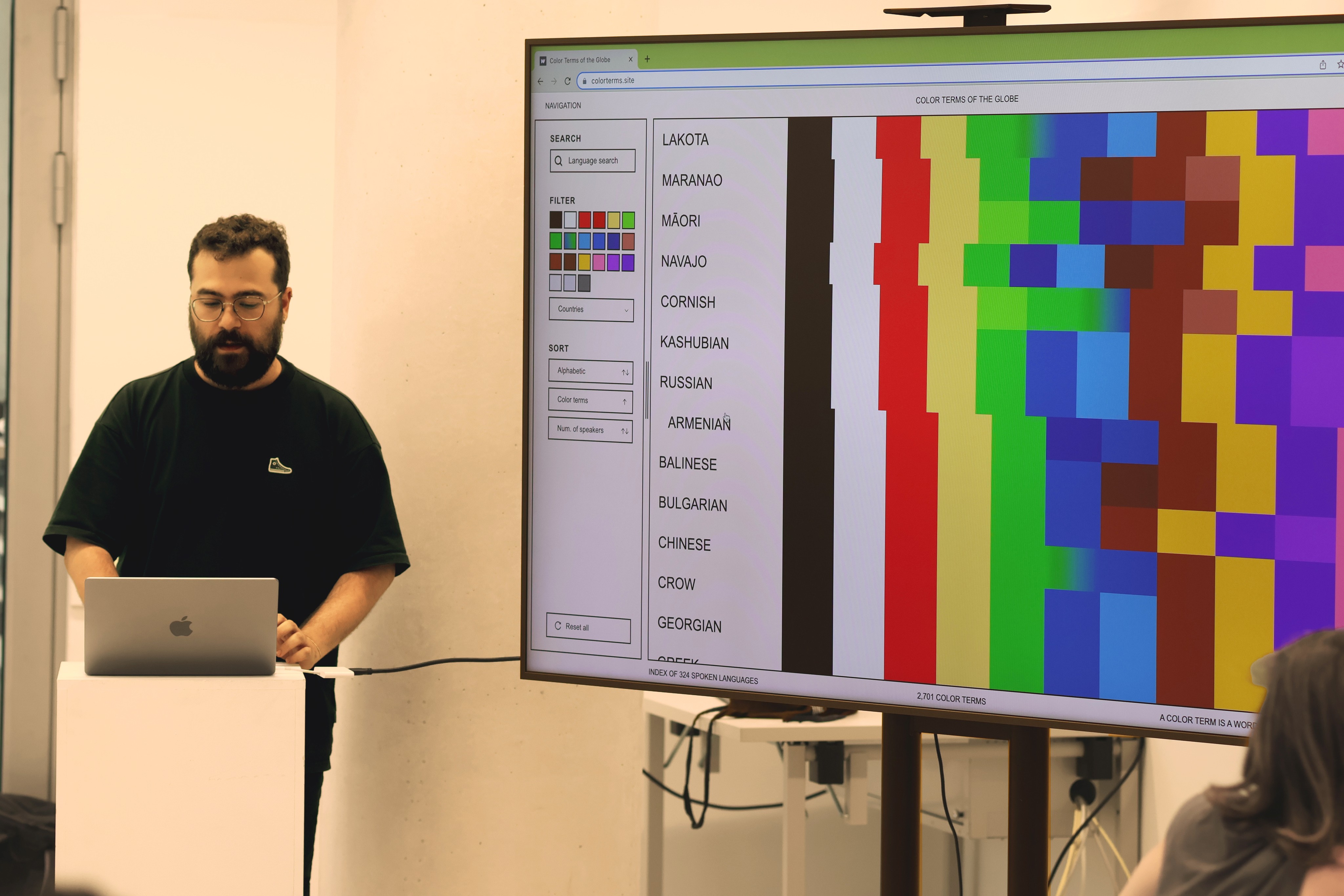
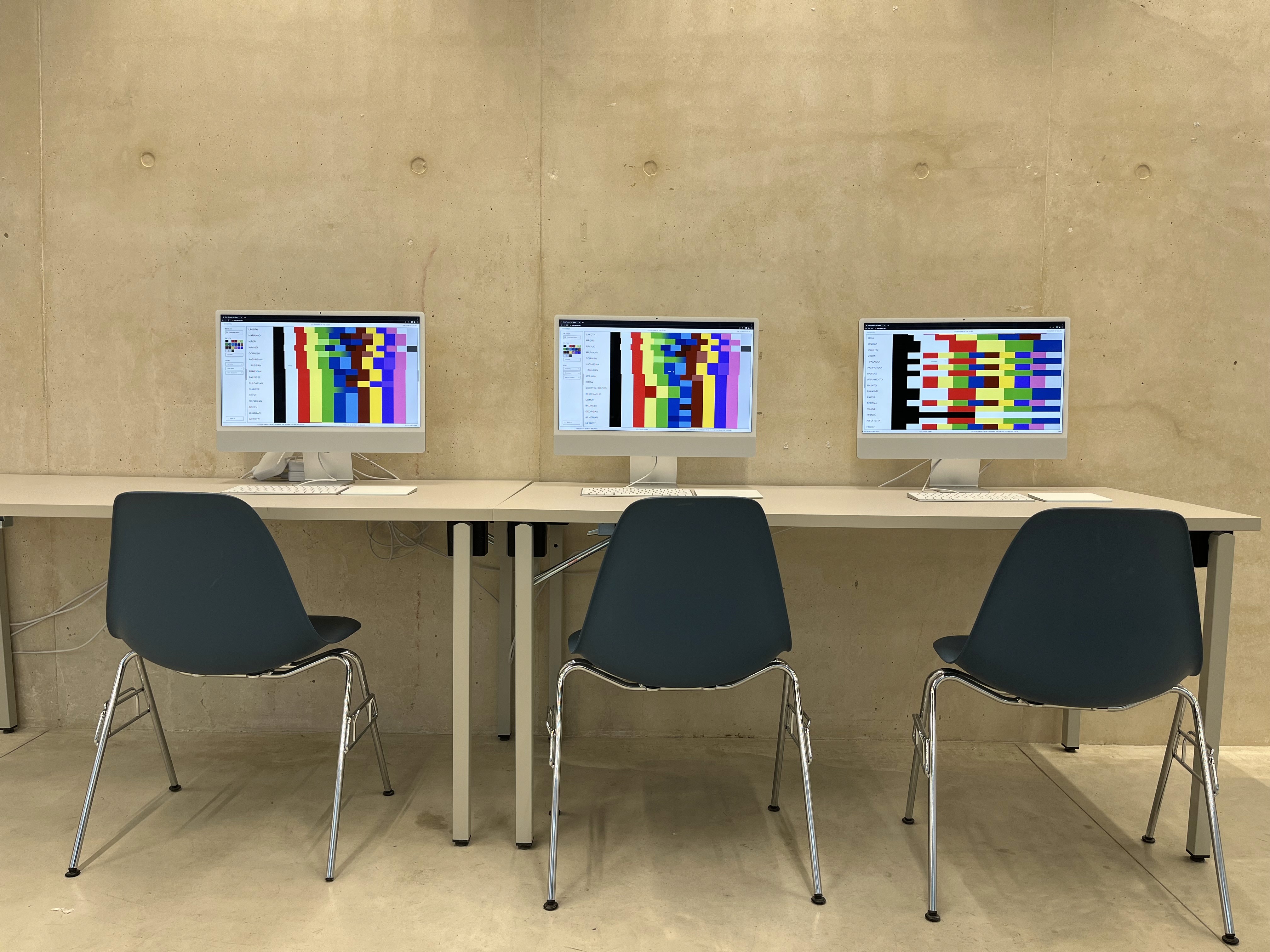
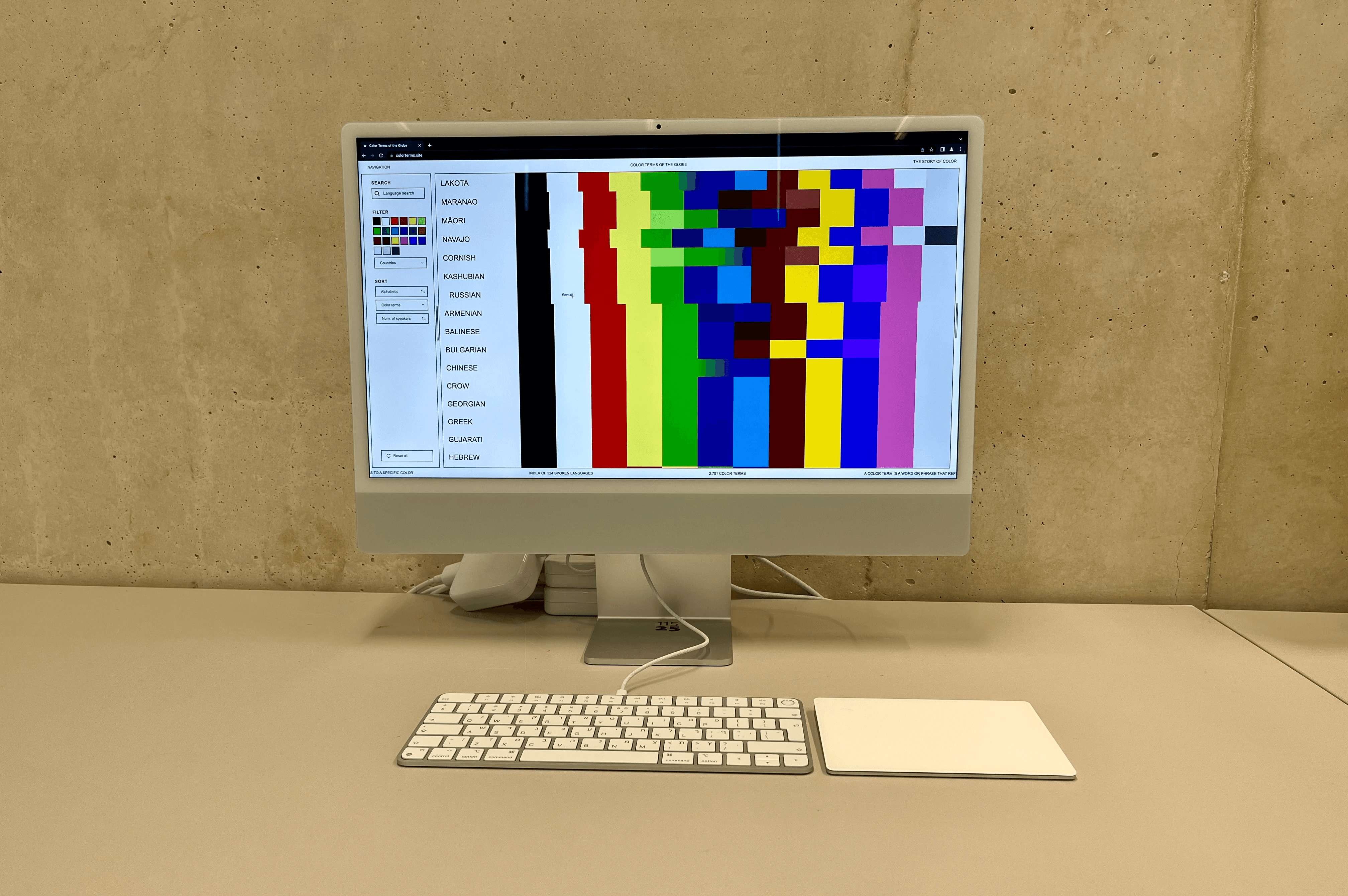
To address the navigational challenges and incorporate richer content, I transitioned the project to an interactive website. Despite limited scripting knowledge, leveraging my understanding of CSS and HTML, I turned to Webflow, a 'no code' platform. With assistance from Chat GPT, I developed essential scripts for filtering, sorting, resizing, and even implemented an API connection to Bing Image Search for visual elements. Transforming the Excel sheet into a CSV file, I seamlessly integrated it using Webflow's CMS feature, elevating the project into an accessible and dynamic online experience.
Design & content adjustments
With the shift to the web, a reevaluation of the design was imperative. Opting to retain a colored background instead of a blank white canvas, I encountered a need for a more globally inclusive aesthetic. While 'Helvetica' initially graced the site, it veered towards a somewhat refined feel. Seeking a more universally neutral tone, I switched to 'Arial.' This adjustment allowed for a more accessible and global appeal. With the design elements settled, I seized the opportunity to reorganize the content. The website now not only features the core research and color terms but also incorporates a comprehensive presentation of my entire research, complete with hyperlinks to referenced articles, additional metrics, and engaging anecdotes.
Outcome
After a thorough research and design process, I successfully built a responsive website from scratch, even without prior scripting knowledge. Leveraging the benefits of the CMS system, the site's database is now easily accessible and editable. Adding or removing languages seamlessly takes just a few minutes, integrating smoothly with the search, filter, and sort options.
The time I spent experimenting with various mediums for the outcome was crucial in understanding the most effective way to present my research. In the end, I made sure not to leave anything behind. All my research, anecdotes, and findings are now accessible online for anyone to see and explore. The site is live and you can check it out whenever you want!
