Menachem
Graphic language for a local Tel Aviv deli serving Mediterranean food.
Overview
Our brief from "Menachem" restaurant was clear: Create a brand that will speak mediterranean, but fine, a homemade food but a classy one. a place that you can feel at home but fine dine with your friends and family.
Logo
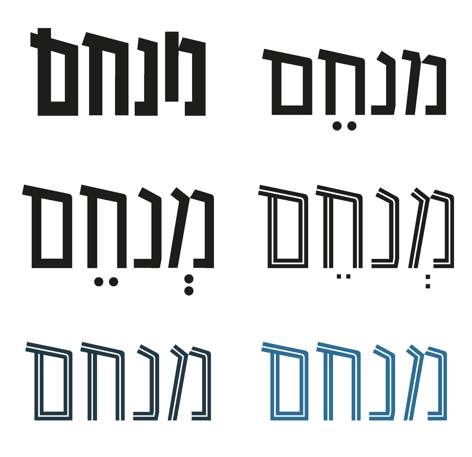
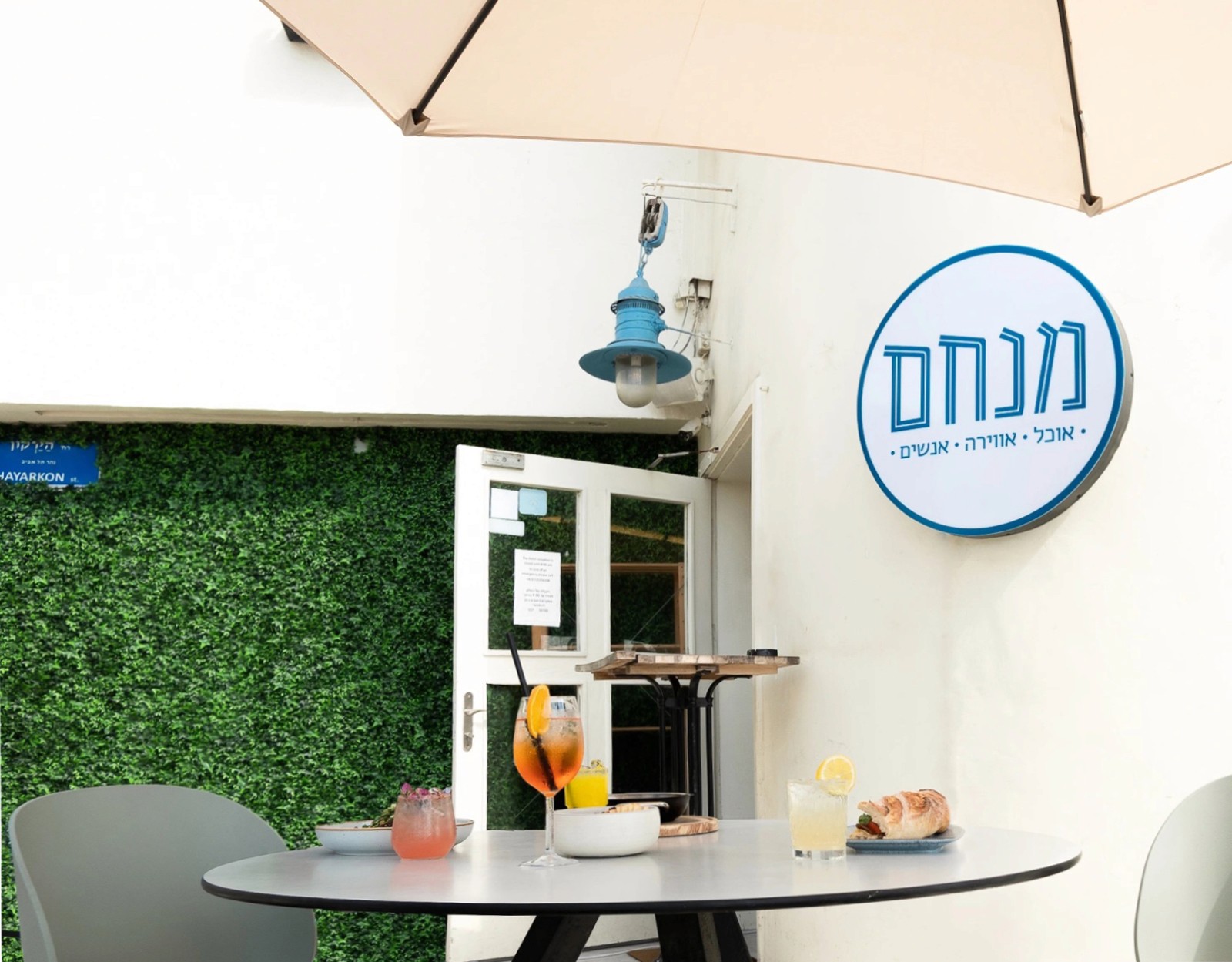
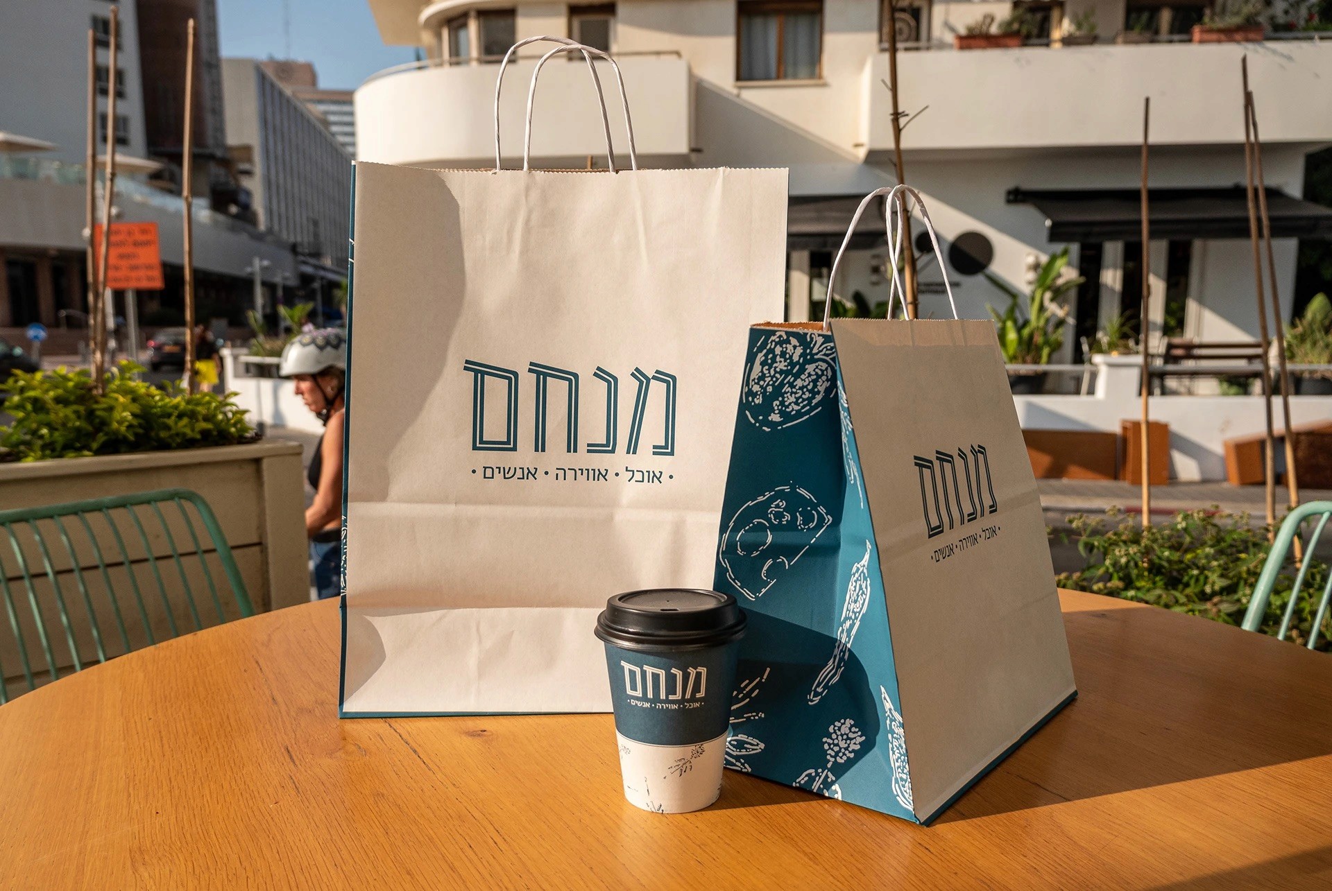
Menachem logo is a modern take on 70s-80s Zionist Hebrew typography, characterized by narrow, hollow letters.
From initial sketches, we refined the design, preserving its cultural origin while ensuring contemporary relevance. The hollow lettering not only pays homage to its roots but also infuses a touch of Greek and Mediterranean aesthetics.
Fonts
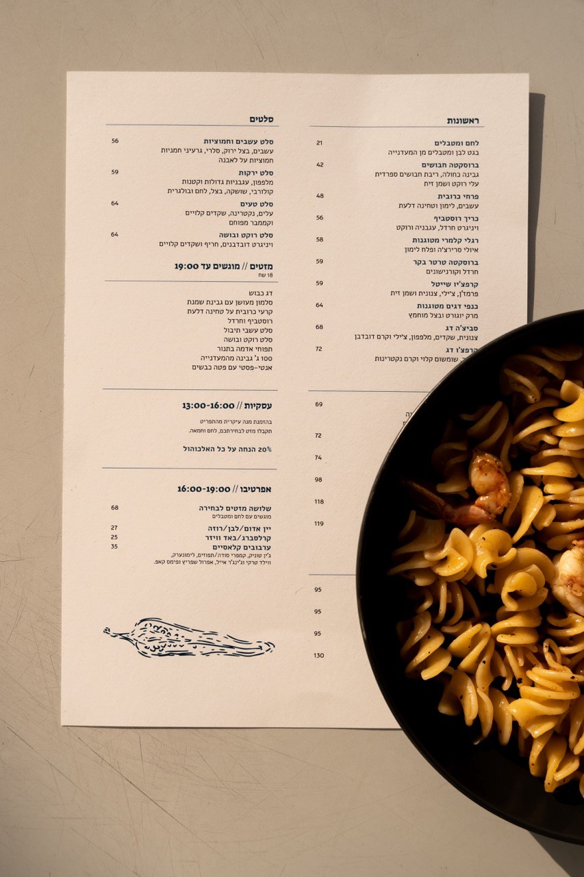
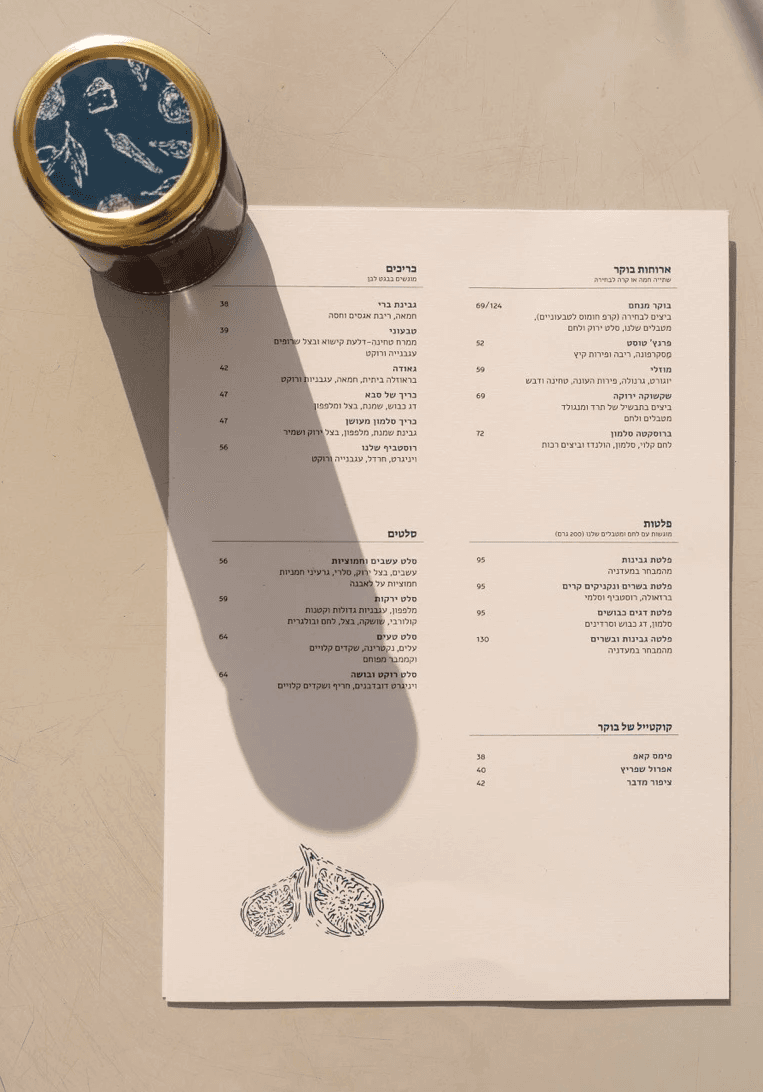
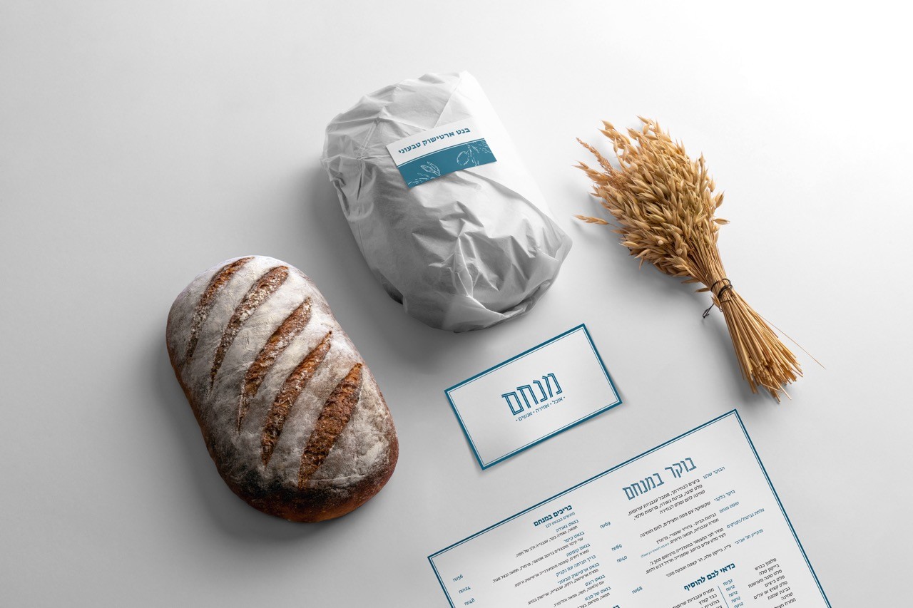
For headlines on stickers and menus, we employed Suez One, drawing inspiration from modern Hebrew calligraphy. This font exudes a contemporary and striking style, making it suitable for titles while maintaining legibility for short texts. On the other hand, for paragraphs and slogans, we opted for Alef. Recognized for its exceptional legibility even in small sizes, Alef possesses a distinct character and incorporates Latin letters, Imparting a human touch that resonates with the brand's commitment to a personalized and inviting atmosphere.
Colors & illustrations
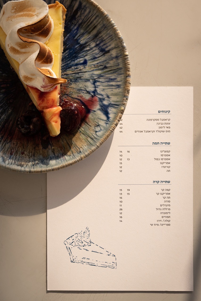
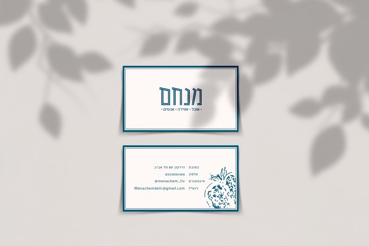
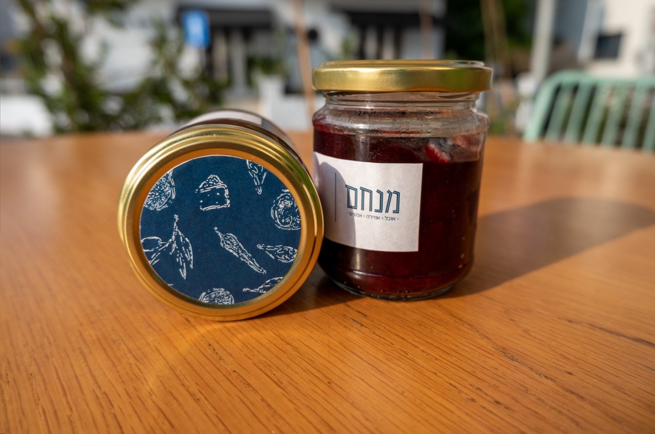
The Menachem brand identity is defined by a turquoise-blueish and white color palette. White, symbolic of Tel Aviv's status as the "White City," intersects with the blue inspired by the sea and Greek influences, echoing the coastal and Mediterranean vibes. The handcrafted illustrations, capture the essence of "home-made food, served deli-to-table." Featuring locally inspired elements such as figs, mustard flowers, pomegranates, and more. These illustrations breathe life into the brand, fostering an authentic connection with the deli's commitment to fresh, locally sourced ingredients.
Social
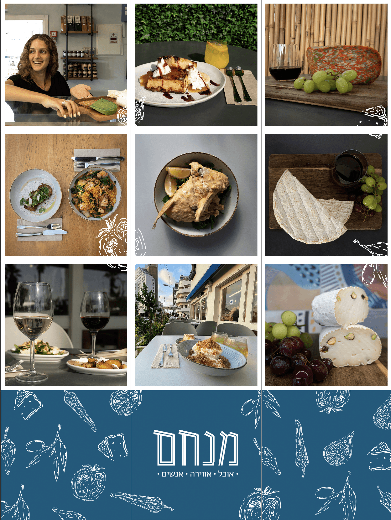
In addition to menus, labels, signs, cups, bags and other products, we crafted a social language for instagram includes posts stories and sponsored videos. We did a photoshoot at the restaurant and created an instagram grid with our illustrations.
Outcome
Guided by the directive to capture the essence of Mediterranean fine dining with a homey touch, the Menachem restaurant brand has materialized as a meticulously crafted identity. The handmade aesthetic, complemented by a serene blue and white color scheme, seamlessly integrates with Tel Aviv's white street color and the ocean views from the restaurant's porch.
The result is a distinct and recognizable branding, effortlessly translating the restaurant's ambiance—a place that feels like home yet exudes a classy fine-dining experience, instantly recognizable on the bustling street.
